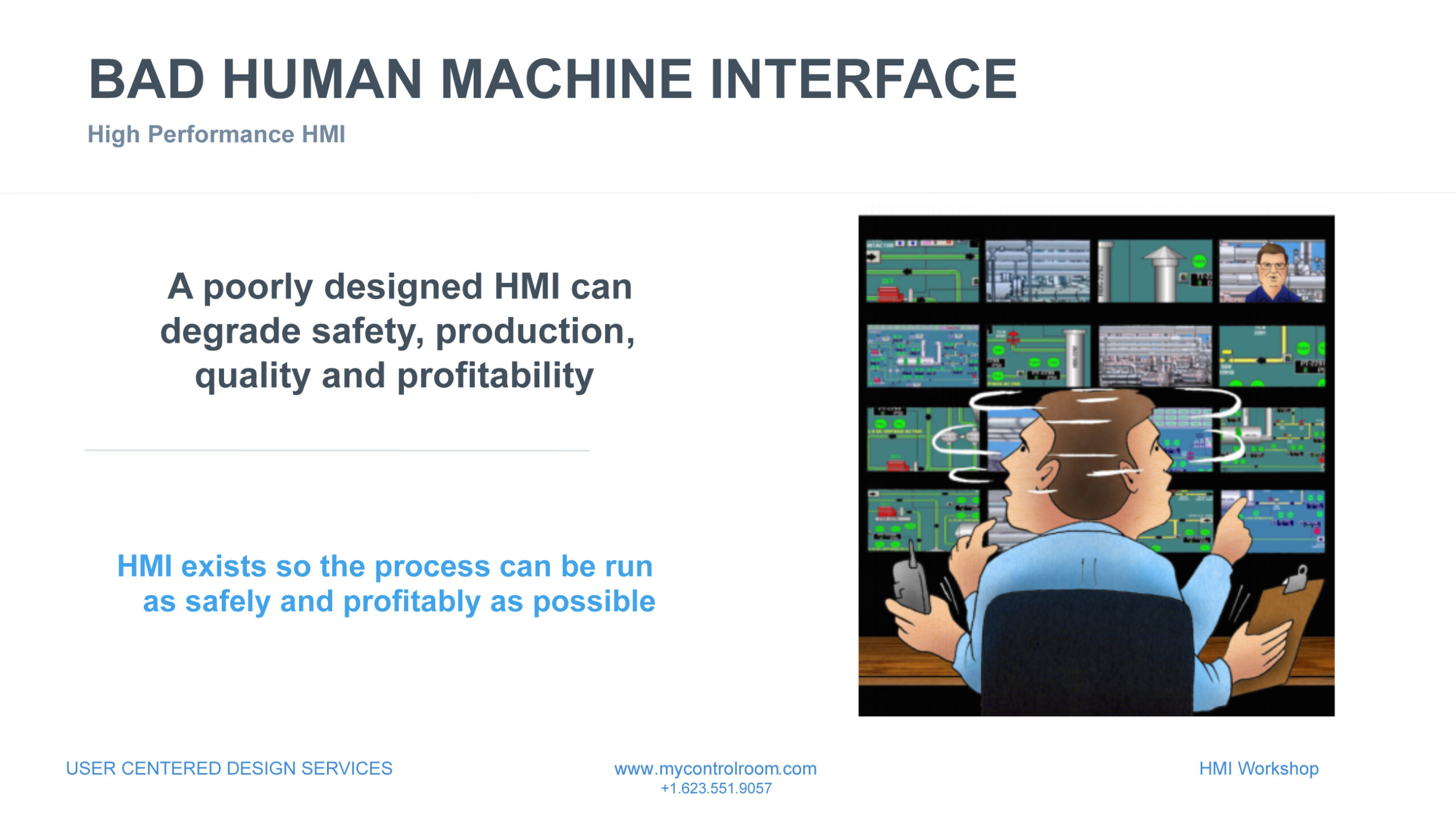
What is the deal with High-Performance-HMI?
Something important in this title is the word high-performance, meaning it should deliver human performance improvements. Performance refers to the ability of an individual or a system to execute a task efficiently and effectively. In general, good performance is characterized by high speed, accuracy, and consistency in achieving the desired results. It can be measured in various ways, depending on the context and the objectives of the task. For instance, in the context of computing, performance may be evaluated in terms of processing speed, memory usage, and response time. Similarly, in the context of sports, performance may be assessed in terms of physical fitness, skill level, and endurance. Overall, performance is a crucial factor in determining the success of any endeavor, and improving performance is often a key goal for individuals and organizations alike. In this case, an operator can detect, diagnose, react, and resolve issues while monitoring and controlling a process using today’s performant control systems.
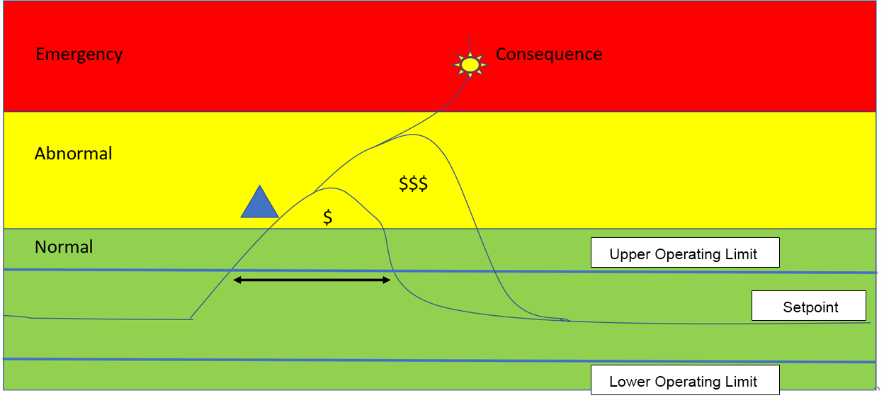
The Human Machine Interface (HMI) is one of the most powerful tools an operator has to provide good Situation Awareness. To achieve this the HMI must be multi-functional and provide information in three forms, the current situation, past information, and predictive information. These categories break down data into normal operations envelope, off-normal, abnormal, and emergency operations.
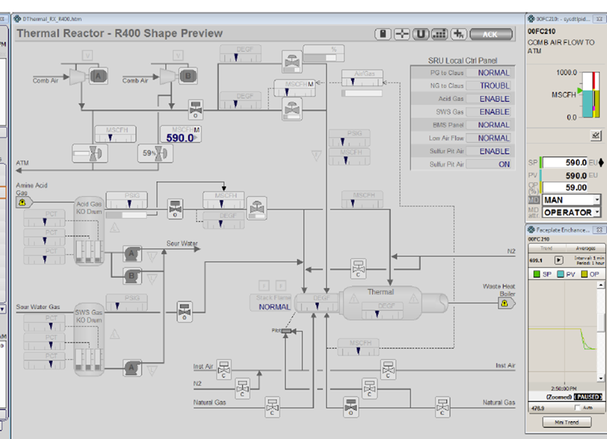
The abnormal and emergency zones are supported by alarm management techniques that relay information through the HMI to the operator, however, they are not always efficient. While the normal zone becomes part of the HMI hierarchy. The HMI uses perceptual layers of information, at the very back of the graphic. The fixed information is the first layer and contains reference information such as vessels, equipment, etc. The next layer contains changing information such as process variables, temperatures, pressures, flows, levels, etc.
The next layer which is often missing is one of the most important layers to help the operator be ahead of problems as the process moves outside operating envelopes. We call this layer the off-normal mode. The HMI design must use techniques to emphasize the process variable is currently off normal. Lin & Associates use a nice technique called bar mode. During normal operations, variables are shown by gauges with operating limits, as the variable moves outside the operating envelopes the gauge changes to a number. When the operator sees the number, their goal is to get the process back within the operating envelope before it escalates to abnormal and becomes an alarm.
Example graphic courtesy of L&A.
The graphic shows the process variables as meters with indication lines illustrating upper and lower operating limits, if a variable moves outside the operating envelope the meter is replaced by a number, indicating to the operator this variable is no longer within the set operating envelope and is moving towards an alarm condition as shown in the circle above. Alternatively, the graphic may show the meter still but place the number above the meter. This is designers’ choice and operator’s preference. This technique is a good way of illustrating off normal conditions, however, there are many other ways to achieve this goal, one being user alerts or notifications.
The operator has a toggle button to be able to switch from meter mode to number mode anytime they want. However, we recommend that when an operator is doing a round on the displays they use meter mode to quickly identify any off normal operating conditions. These off normal or abnormal conditions can also be highlighted on the navigation bar.
The design may also show a dynamic progression awareness as illustrated below as the variable escalated to an emergency condition. This allows the operator to see how close they are to the next escalation within alarm management priorities going from normal to (as illustrated by the needle) off normal, then low priority alarm, to high priority (not shown) and finally to Emergency priority.
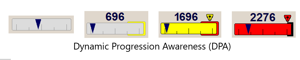
Courtesy of L&A
The next perceptual layer after off normal is abnormal, which is where our alarm priorities are illustrated as the variable moves close to the consequence that the alarm is protecting us from. The final layer is the one termed Emergency, where trips are initiated by SIS and may start an avalanche of alarms and a consequence due to no action from the operator. Not every alarm is associated with the SIS only the ones with a safety impact. The alarm system model is one of reactionary mode of operating, a better solution is for the operator to be predictive using off-normal to correct the problem before it escalates to an alarm condition.
The other characteristic of High-Performance HMI is the Hierarchical structure of the information. In the past there was no hierarchy, only a flat graphical representation as P&IDs were copied and used to monitor and control the plant. Operators attempted to create an overview of the process by calling up multiple displays on multiple monitors. This is a good indication of the critical information needed to provide an overview of the process. During a task analysis we extract from the operators the information that is important to them on each of these screens. This is the first stage in the development of a Level 1 Overview Display. Obviously, the information collected needs to be vetted. I see a need that the most critical information has been classified within the Highest Priority alarm category (Emergency or Urgent), these alarms require an immediate response from the operator and must not get lost in a flood of alarms.
They should be predominantly displayed on the Level 1 graphic so that the operator can rely on this display to help them prioritize what they are required to work on next and avoid the tunnel vision that has led to catastrophic incidents.
Finally, the level 1 display may contain other important information such as KPI’s, CCTV displays and fire & gas systems. To be determined by the HP-HMI design team during the task analysis, which should always include operators in the design. We never want to put information on a display that is not needed by the operator. A good exercise is to ask the operator to show you all the things that are on a graphic that they do not use.
I see that some manufacturers have chosen to supply a large 50” display per console and tried to emulate their previous quad stations, which does not consider viewing angles and requirements for viewing displays as outlined in the ISO 11064 standard for Ergonomic Design of Control Buildings.
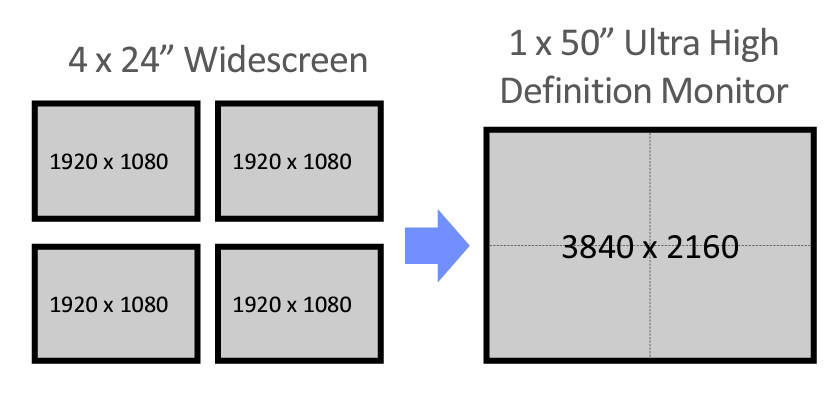 Conversion from quad station to single screen replacement
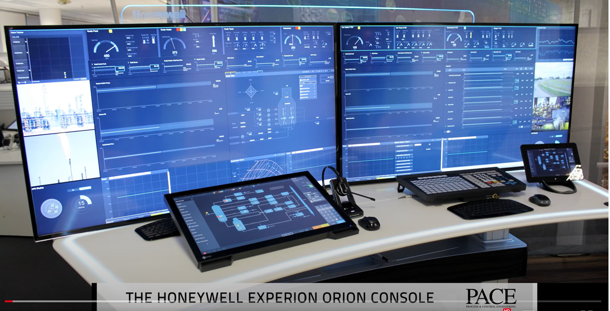
Honeywell Orion Workstation Console
This solution is poor, if one display fails the operator loses a minimum of 4 displays. We have even seen seven displays being shown on one of these large screens. This solution has left a narrow band at the top of the screen for use of Level 1 displays, which has a limit on what can be displayed on the overview screen and certainly not what I have just outlined from the task analysis done earlier to identify what information is required. This has resulted in operators finding no benefit from the Level 1 display and is not providing the Situation Awareness that is required. This is a good example of how an operator display project with good intentions can impede operator performance.
It also has some ergonomic issues. The touch panel keyboard is too high and blocks the bottom of the screen. Many operators still prefer the operator keyboard on the right side. The touch pad keyboard suffers from major glare issues due to its angle on the desktop. However, it does provide the availability to put a graphic on the screen and make moves. To eliminate the loss of view at the bottom of the screen many users just raise the 50-inch video screen higher which causes the operator to have to bend their neck to see the level 1 partition. Raising the screen blocks the glass panel behind the screen from displaying alarm notification, which can be good when normally the glass is bright white from LED’s, and the Honeywell logo catches the eye as it is too bright. Brand advertising has no place on the operator desktop.
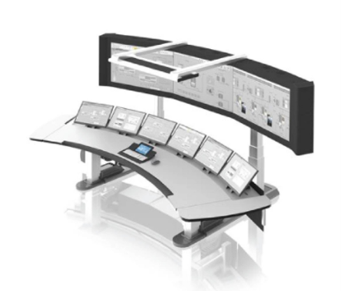
ABB have provided what I believe is a better solution using a powerful KVM smart keyboard, provided by Weytec. The console originally designed by CGM offers lower screens that can raise, lower, or change their display angle by motorized controls. The large screens can bring the display forward, or move away, raise, or lower. This added functionality and real-estate can provide powerful Level 1 screens. The ability to provide operating mode displays such as plant startup or shutdown displays. This ergonomic solution is a much more powerful option, providing conformance to ergonomic standards and good situation awareness.
During the task analysis for Level 1 display design, I use a technique called (CADET) Critical Action and Decision Evaluation Technique. To resolve a problem that requires an immediate response this methodology allows you to trace the diagnostic process an operator needs to use to resolve a critical alarm. Once you have determined the data needed to diagnose these alarms you can ensure that your Level 2 displays have quick access to this information.
The Level 2 display should provide the controls required for the most common moves. A list of the characteristics in each of the hierarchical levels is found in the International Standard IEC 63303 or ISA 101.
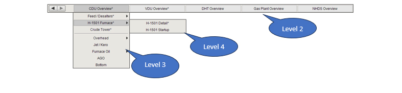
The example below shows the hierarchy: Level 1 catches the operator’s attention to a potential problem, level 2 allows them to control and diagnose the problem, and level 3 is used to drill into the equipment detail in question. While the level 4 screens offer a range of diagnostic or details such as trending, vibration monitoring or other important but rarely used information. The idea is to design the displays using a task analysis methodology that provides the operator with a navigation scheme that supports the way they think and work. This will improve human performance.
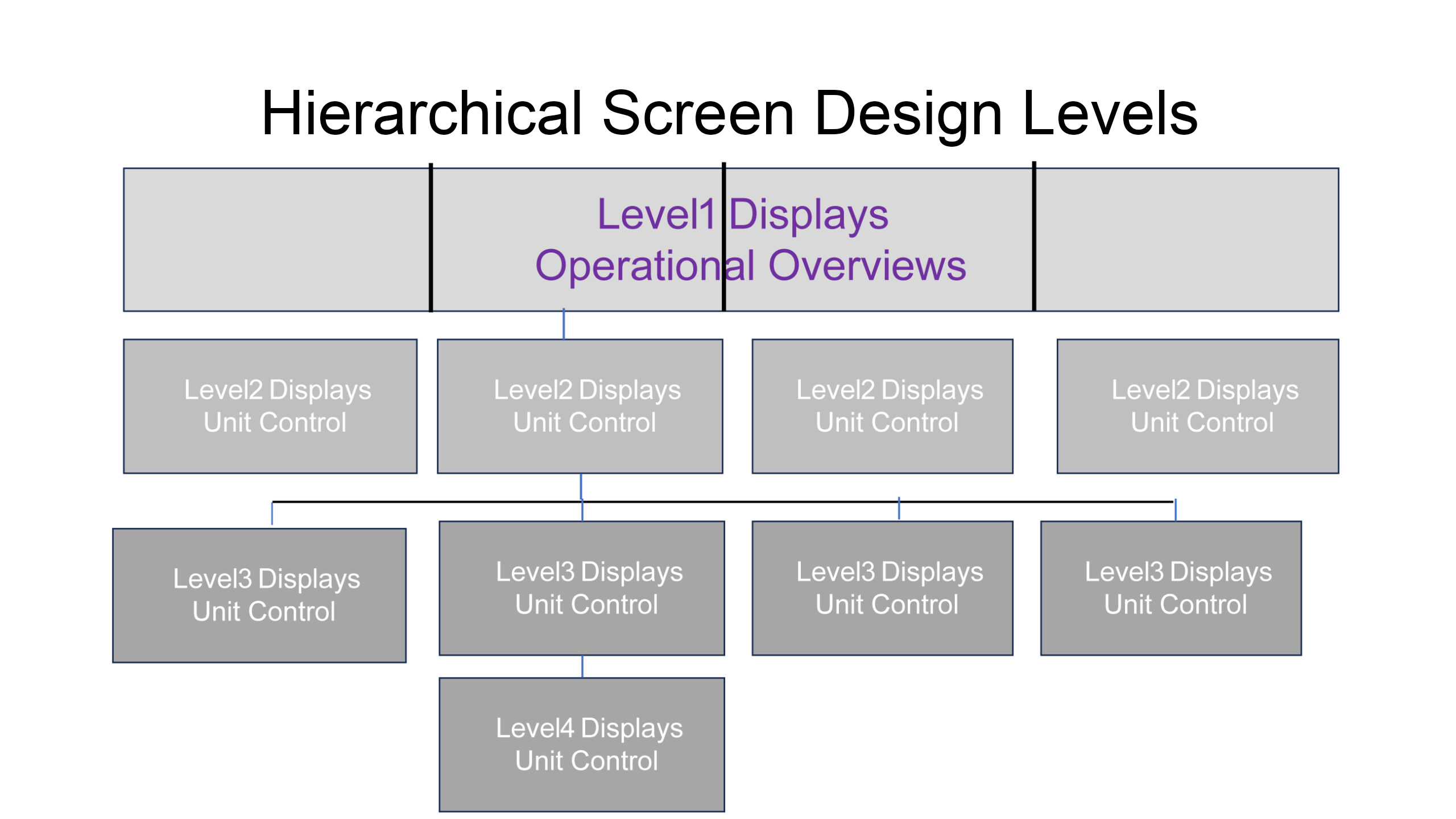
The hierarchical display shows that this console has an overview with four operational units, each having its own level 2 display, from the level 2 the operator can navigate to multiple level 3 displays some of which have access to more detailed level 4 diagnostic displays.
Below is an example navigation bar showing five level 2 screens, and from the CDU level 2 screen navigation to 8 level 3 screens of which the H-1501 Furnace has 2 Level 4 screens.
Note: The Level 1 overview has no navigation as it should be on permanent display.
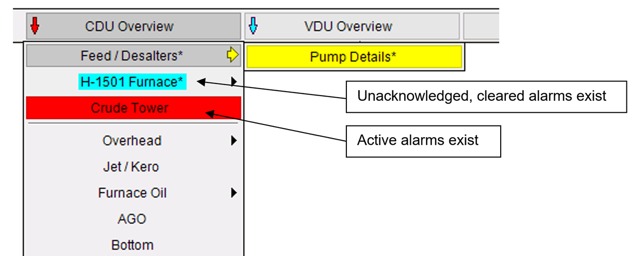
Abnormal and off-normal conditions flagged on the navigation bar.
There are other important aspects of High-Performance HMI such as always trying to put data into context. In the past we had a practice of putting temperature values down a column, allowing operators to examine each value and determine if it was in range, which often meant operators knew the difference between a good value and a bad value. This involved a lot of cognitive workload and took time.
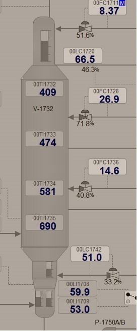
Temperatures down a column
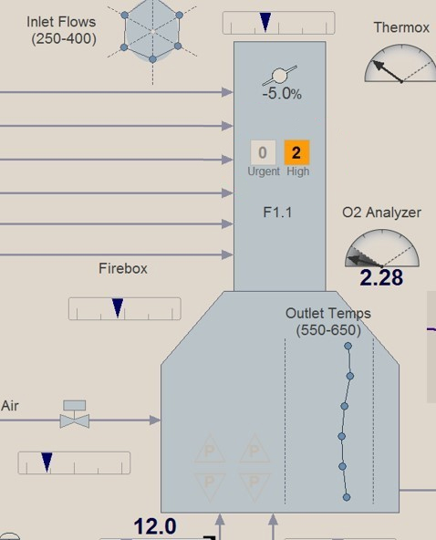
Today we create a temperature profile represented by a straight line when the temperatures are within specification and easily illustrating a cool or hot point. Also using our off-normal technique we place a temperature next to the line when off-normal or backfill the value with an alarm color when abnormal.
Ian Nimmo
Founder & Owner UCDS Inc.
Senior Life Fellow ISA
Inducted into the Automation Hall of Fame 2001
Member HFES CEASE 1
NSPE